Tackling Topsy.
A case study in design, ethics and challenging content.
As a designer, I’ve always been interested in the ethics of my craft and have tried to take my responsibilities as an image maker and communicator seriously. I’ve always been sensitive to the power of what we see, how we ‘read’ an image and how we interpret what is before us. How to manipulate meaning and context, and crucially, understand my responsibility to do it well.
Images are my language, I can tell stories, change minds, and right wrongs, I have the power to change someone’s political stance or suggest they buy more expensive toilet paper.
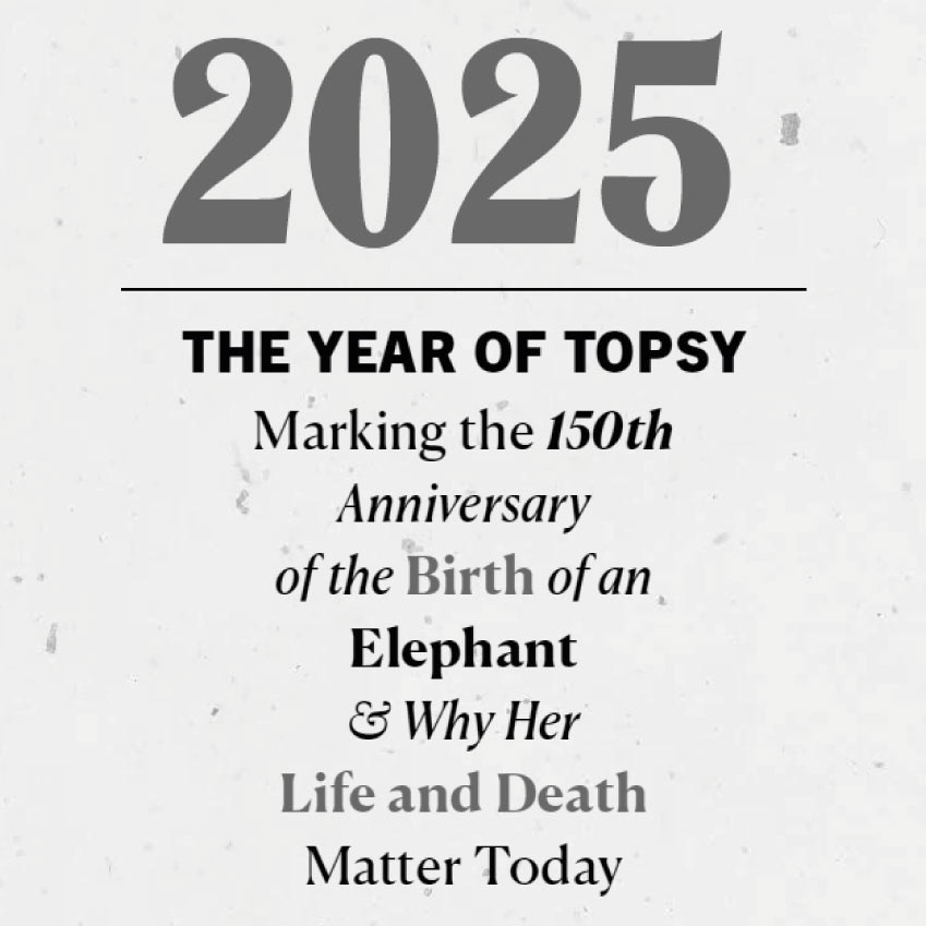
I’m currently working with the academic Kim Stallwood as he develops his next project, a biography of Topsy The Elephant.
For those of you unfamiliar with her, Topsy was a wild born (approx 1875) female Asian Elephant, who was ‘executed’ in Luna Park, New York on January 4th, 1903 by electrocution. The event was filmed by the Edison manufacturing company and shown widely in cinemas and theatres. That film is still available on Youtube and has almost 1.4 million views. ‘Electrocuting The Elephant’ is seen as a pivotal moment in cinema and media studies. From an act of cruelty to a public spectacle to somehow a respectable academic curiosity.
Topsy’s story is far more complex than her cruel and untimely death and includes a cast of prominent Victorian showmen, two ugly incidents that were widely reported in the newspapers that ultimately lead to one man’s death and a groundswell of public opinion and media pressure that resulted in her poisoning with cyanide, an aborted public hanging and her ultimate destruction in front of 1000 spectators.
The story itself is so shocking and cruel that it’s almost impossible to understand such a thing happening in the modern world, or that it somehow still remains a piece of online entertainment.
From the very start, I talked with Kim at length about how I should approach the project, and how he would try to give Topsy back her voice, tell her truth, and return to her the dignity she was robbed of in life. Part of the book would be imagined in Topsy’s own words, with a further examination of how we still view elephants as entertainment, as a beast of burden, and how we anthropomorphise them, investing them with human characteristics of our own invention and convenience.
From the start, there was always one thing I knew I could not do. Show images from the film, or of Topsy herself and try to avoid photographs of any other elephant in captivity. Doing so would make me, and the audience, complicit in the continued crime against her. I would be recreating the spectacle over and over again, undermining what Kim was trying to achieve.
Kim was mindful that even people within the animal rights community were reluctant to talk about Topsy, it’s too distressing and ugly, and the images too cruel and traumatising. Nobody wants to ‘see’ this — or hold it in their heads. It’s too much.
I used only one image of an elephant. A modern, generic, stock image focussing on a single eye of a wild elephant — then either redrawn as a victorian style engraving or processed as a vintage tintype photograph to contextualise the period. I saw the eye as a witness, Topsy looking back at us, looking at her. A recreation of her cruel circumstance — trapped as an exhibit during and after her lifetime. I did this to emphasise the sections of the book in her own voice, bringing to life the world as she saw it through her own eyes, and now as she sees us. An eye that accuses, and wants to ask why?
I used only one illustrated image of an elephant, from a contemporary lithograph (of an Asian white elephant owned by the same company as Topsy). The animal is seen side on, being examined by two pairs of men — one pair to the front, one pair to the back, I used this to visually bookend the first promotional publication — front and back — and suggest how she was in life, scrutinised and evaluated as an asset, from beginning to end. It also seemed to me that in profile, she resembled a butcher’s blackboard illustration of prime cuts of meat.
I decided early on not to use any contemporary illustrations from newspapers or billboards, they were either of sad-looking animals in chains and harnesses or impossibly cartoonish caricatures in skirts, pompoms and pointed hats, riding bicycles, juggling or balancing on balls wearing lurid, clown-like grins.
With the human cast, I could only find reproductions of small, poor-quality newspaper photographs that I was able to improve, standardise and contextualise so that they were all visually equal, using the right visual language to insert them into the story.
I used two simple typographic styles that echo victorian playbills but cut for modern, digital platforms. The styling of the promotional booklets resembles the political pamphlets of the time, an underground voice urging compassion and reform, hopefully, the same language and delivery I use now can perform as well as it did then.
My role was to create context and a visual language to support the text, honour the subjects, and, of course, Topsy, I wanted to give her back the voice she was denied in life, and not overwhelm the work Kim was doing with unnecessary decoration. By careful use of image, break down the barriers that held people back from fully engaging with her story.
As we launched the first round of funding, Patreon issued new guidelines about animal content and cruelty in particular. I broadly agree with their stance, but I can understand how the line between truth and exploitation can be blurred when appealing for help and attention. We have to take our responsibilities to our audience and our subjects seriously. I hope I’ve been able to bridge the gap between what we need to see to understand, and what I needed to shield the audience from.
